


Any colour so long as it’s not white

Indeed, Kevin McCloud has written a book called Colour Now, and has produced a paint range for Fired Earth, incorporating strong tones of turquoise, sunflower yellow, terracotta and ripe bracken green, called Mid-Century Colours.
David Oliver, co-founder of the Paint & Paper Library in London, says the reason for this explosion of colour is 'because we are not moving house so often these days.' During the property boom, people were advised to use neutral colours for easier resale. 'Now, people are staying where they are for longer and want to inject a bit of personality into their homes.'
A few years ago, Oliver came up with the Architectural Colours range, which shows how to use different shades of a neutral colour for skirting, walls and ceiling. Recently, he has introduced stronger and darker colours, such as mustard, plum and what he calls 'the colour that is the shadow of an evergreen hedge'.
David Oliver says he has been inspired by trips to North Africa. In fact, we are all increasingly exposed to colour because we all travel so much more – to India, with its vibrant orange and pink fabrics; to North Africa, where walls are painted in brilliant blues, oranges and greens. However, the light in India and Africa is very different from that in the UK.
'Back in England,' Oliver continues, 'we cannot just duplicate the colours we have seen on holiday. To work in this northern light, tones have to be dirtier, with hints of burnt umber. Lemon yellow or the colour of Golden Shred marmalade do not look good on British walls.' Oliver still favours toned neutral hues for larger rooms, but recommends strong colours – such as red and orange, which give a feeling of warmth and intimacy – for small rooms, such as hallways or bathrooms.
'Red, blue and yellow never looked as well as they did in the late 1950s,' says Kevin McCloud. 'Bird's Custard yellows seemed to be comforting, and solid blues dark and reassuring. I don't know if colours can be optimistic, but these primaries did their best.'
Perhaps this explains the interest in all things 1950s today. In the middle of a recession we need to be cheered up and reassured. Blue – in its many tones – is very fashionable in 2012. Pale and mid-blue give a sense of light and airiness, whereas royal or turquoise work well in a study or small sitting room. But to add warmth, put some red-gold or yellow somewhere in the room.
'We are more knowledgeable about the use of colour these days,' says Marianne Shillingford, creative director of Dulux. 'And the internet and eBay allow us to see so much more, too.'
Dulux does a lot of research into colour and especially into the shades that experts are currently using. Every year at the AkzoNobel (Dulux's parent company) Aesthetic Centre in Amsterdam, people from the world of fashion, furniture design, pop music and advertising congregate to discuss trends. This year, according to Shillingford, the colour they all love is a strong pinkred that Dulux has translated into a paint called Firecracker 4.

Red, of course, represents good fortune in China, and marital bliss and insightfulness in India. According to Dulux, red is a powerful mood modifier: 'Like a jester in a pack of cards, red will brighten your life in unpredictable ways.'
For some, however, painting walls strong colours can be daunting; people worry that they might not be able to live for a long time with a vibrant or rich palette. Marianne Shillingford suggests that if we are hesitant about painting a whole room orange we should just use colour or bright highlights around the house.
McCloud is a fan of using colour on the dado or skirting board. 'It's a practical solution for hiding the dirt and a way of introducing a strong colour to a room without overpowering it, or you.' Another place he recommends strong hues is at the back of a bookcase, where the wall is white or neutral. 'Slabs of colour can give a room some real definition.'
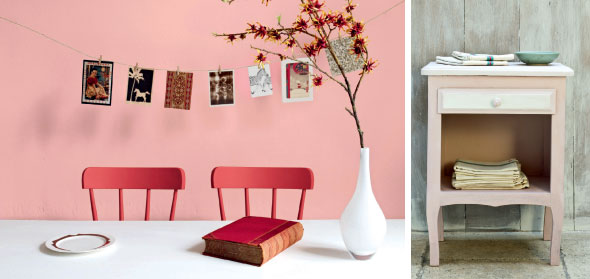
A clever way of adding contrast is to paint furniture in a bold tone. Annie Sloan's Chalk Paint needs no primer and can be made shiny with wax. Among the 28 shades, there are some vibrant colours.
Marianne Shillingford puts it like this. 'I like to compare a house with a jacket. The outside may be traditional, but underneath is a colourful lining.

Where to buy
Annie Sloan Interiors 33 Cowley Road, Oxford OX4 1HP: 01865-247296, www.anniesloan.com
Dulux 0844-481 7817, www.dulux.co.uk and Dulux Design Service 0845-880 6888, www.duluxdesignservice.co.uk
Kevin McCloud's Mid-Century Colours at Fired Earth 0845-2938798, www.firedearth.com
Kevin McCloud's Colour Now is published by Quadrille, price £9.99.
Paint & Paper Library 5 Elystan Street, London SW3: 020-75909860, www.paintlibrary.co.uk